4 Improvements to Learners’ Exercise and Mastery Experience in Kolibri v0.10
A run-through of UX enhancements made to exercises and mastery.
Research has shown the benefits to learning that result from giving learners instantaneous feedback on correctness. This is one of the great features of Kolibri, a platform designed to run on low-power devices, targeting the needs of learners and teachers in contexts with limited infrastructure. The upcoming release of Kolibri v0.10 contains many improvements to learners’ exercise and mastery experience.
1. Placement of the ‘hint’ button
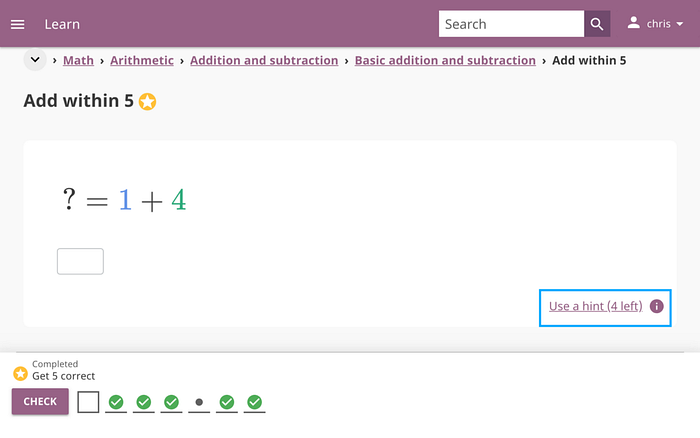
One issue we often heard from our pilot implementers, and observed first-hand through site visits, was that learners would accidentally click the ‘hint’ button. This was due to its proximity to the ‘check answer’ button. Accidentally using a hint would have resulted in learners ending their answer streak. For context, the goal for a learner is to master an exercise which involves getting M questions correct, out of the past N questions answered.

To resolve this, we decided to move the ‘hint’ button to the right, so it was no longer close to the ‘check answer’ button. We also changed the appearance of the button to make it more subtle than the ‘check answer’ button.
2. Placement of the ‘check answer’ button
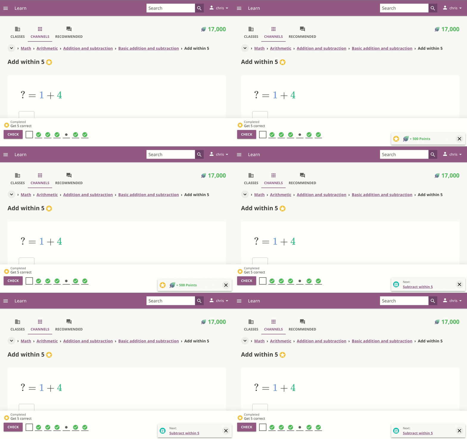
Another issue was that the ‘check answer’ button was not always visible within the viewport. This was especially common for users with small screen devices, like the users that access Kolibri through the Vodafone mobile network on their phones. This led to learners, especially new ones, not knowing how to check their answers after typing them in. The ‘check answer’ button was placed under the exercise. As a result, the button’s visibility within the viewport depended on the height of the exercise and device. Hence, the ‘check answer’ button was not always visible. This was a big issue since checking the answer is the most important action in an exercise. We also observed that learners spent a lot of time scrolling between the exercise and the ‘check answer’ button.

Our solution was to make it always visible by fixing it to the bottom of the viewport.

3. Exercise attempts timeline
The exercise attempts timeline is a UI component that is meant to make mastery of an exercise easier to visualize and comprehend. It consists of the current question attempt, and past questions’ attempts. For context, an exercise consists of multiple questions, and each question can have multiple attempts.
We observed that this was often hard to understand by learners for various reasons. The difference between the current question attempt and past questions’ attempts was not clear.
To address the issue, we made the current question slot visually distinguishable from the past questions’ slots.

The current question slot can be in one of four states:
- Empty: No attempt has been made for current question
- X: Attempt for current question is incorrect
- Light bulb: A hint was used for current question
- Gray dot: Attempt for current question is correct, but was not the first attempt.
- Green check: Attempt for current question is correct, and was the first attempt.
Past questions’ slots can be in one of three states:
- Empty: No attempt at question yet.
- Gray dot: First attempt at question was not correct.
- Green check: First attempt at question was correct.
We also observed that the meanings of icons were not clear. In order to tackle this, we added tooltips to icons that now explain their meaning.

4. Mastery notification
We also decided to address another issue involving the notification of mastery.
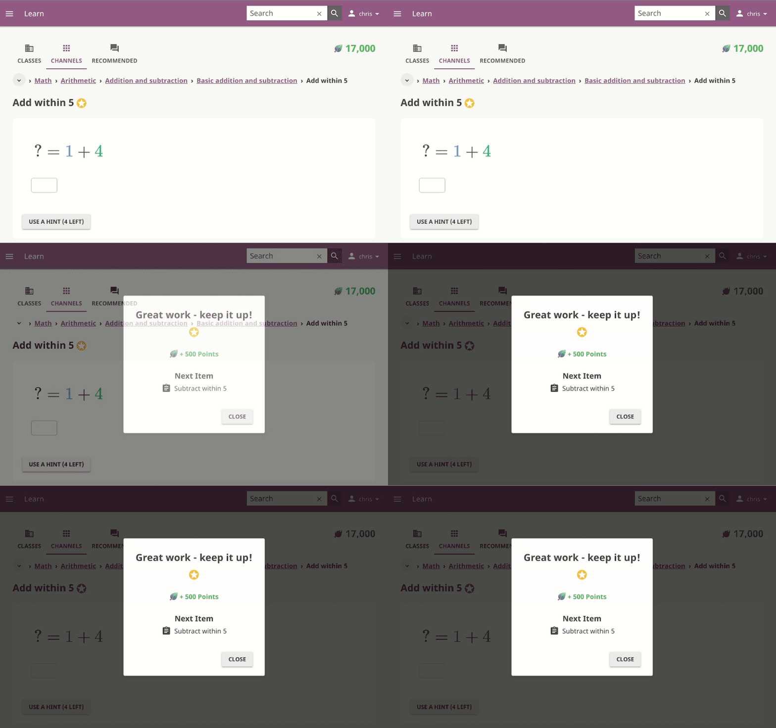
Previously, upon mastery of a resource, a modal would pop up with information consisting of:
- A message telling the learner that they had mastered the resource.
- The points the learner had earned due to this mastery.
- The next item they should move on to.
However, we started to receive feedback that the modal was too disruptive. It would often cause a break in a learner’s focus, especially when engaged in reading a PDF or interacting with an HTML5 app. So we decided to only pop up this modal for exercises, videos, and audio. For other types of resources, a less interruptive notification would appear. This notification consisted of the points that the learner had earned from this mastery.
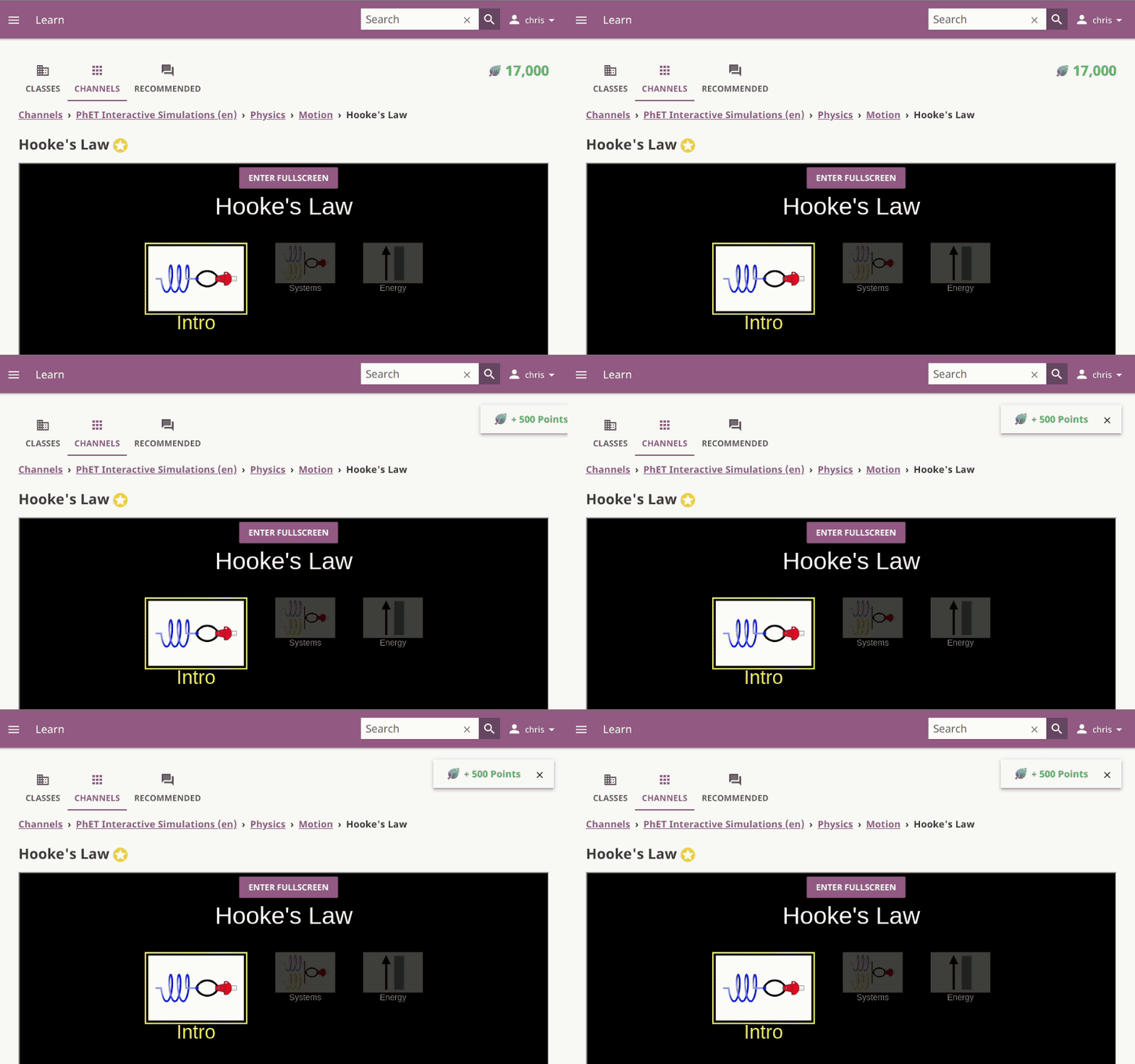
But as a result of those changes, we now had three different issues:
- Inconsistent notifications.
- A modal that could still be disruptive, especially for videos.
- A notification that lacked useful information present in the modal.
In order to solve this, we decided to create mastery snackbars. These appear on all resource types, no longer leading to inconsistencies. They are less disruptive than the modal, yet contain the same information.

Tell us what you think! Comment below or email us at info@learningequality.org.
Learn more
- Visit the Kolibri homepage.
- Try an online demo of Kolibri.
- Download Kolibri
- View all the v0.10 changes in the Kolibri changelog.
- Read our blog post on upcoming QTI integration which will enable us to add new types of exercises.
Contribute
Kolibri is an open source project, and as such we value and welcome contributions.
- Contribute to the development of Kolibri on Github.
- Help translate Kolibri into your language
