How we built equitable design principles at Learning Equality
Design decisions are not always straightforward. In order to help our product team better navigate trade-offs and difficult design conundrums, Learning Equality’s UX Design duo, Jessica Aceret and Khang Mach co-created the Kolibri Design Principles. In this blogpost, they speak about their process in detail and share practical examples for those considering the same path. Shivi Chandra, Learning Equality’s Global Curriculum Specialist, joins them by providing a case study to illustrate these principles in practice.

Hundreds of design decisions have led our products to look and function as they do today. Our product team balances many factors when making each decision: feedback from our users, educational research, our organizational vision, technical constraints, concerns of equity… the list goes on. But in order to identify a pathway forward, we are guided by a set of principles in developing our Kolibri ecosystem of products.
Principles set priorities
Design principles are living, dynamic guidelines that help teams navigate how design decisions should be made. In this practice, there are often no “right” answers. Even with research on hand to inform decisions, it is inevitable that teams face difficult tradeoffs.
At Learning Equality, we’ve had situations where we had to decide whether one type of user needs should be prioritized at the expense of another. Other times, our products can’t technically support the full vision of a design (our Kolibri Learning Platform, caters to older devices and browsers, for example), so we had to decide what design features to prioritize in an MVP.
This is where our design principles provide clarity on our priorities at a foundational level. Without a shared understanding of these priorities, making design decisions can be difficult.
Scoping our principles
In early 2020, we started to map out our principles. In order for them to be useful for our day-to-day work, we were intentional about these foundational qualities:
- They should help us document recurring justifications for decisions. Common reasons for decisions that are essential to our products can be captured as a principle.
- They should be specific to our users and their contexts. Design decisions or principles that work for other products might not work for ours; the needs of the people we design for should always come first.
- They should set higher design standards for our team to aim for. They should guide us forward as we improve our products and work towards fulfilling our mission and vision.
- They should remain true across many internal design scenarios. Having principles be consistently true means we can rely on them regardless of what feature we’re building or which specific user needs we’re designing to address.
There were also a few things we wanted to avoid:
- Creating but not using them
- Choosing generic guidelines that would not help us make decisions
- Using them to replace creativity, good judgment, and research
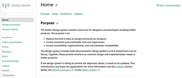
Finally, we understood that our principles would have limitations. They wouldn’t help us make decisions about finer design details like exactly what color or user interface component to use. So we decided that those types of decision-making would be better informed by another set of guidelines, our own Kolibri Design System (in-progress).

Getting team input
For these design principles to help with decision-making, they should be something that designers and the rest of our team could get behind. Given that our colleagues both collaborate in the design process and communicate with our users who provide feedback, we wanted to ensure that we were considering various perspectives.
As a starting point, we decided to run a team survey to learn a couple of things: what decision-making problems the principles should target, and what the content of the principles should focus on. We asked our team four questions:
- When was a time when we could have used direction in decision-making? (This can be about a particular feature or about overall design processes).
- What’s the most important thing a new member of our team should know about our products and how they are designed?
- What does good design mean to you for all of Learning Equality’s products?
- What is unique to our users that we can’t ignore in our design process?
We used Figma to organize the team’s responses, group similar answers, and develop categories for different types of themes that emerged. Then, we used these patterns as the foundation for six principles.
Next, we wanted to get feedback that represented the diverse perspectives in our organization without interviewing every employee. We chose colleagues who represented specialized domains in our org. At Learning Equality, these people are the founders, pedagogy specialists, lead developers, accessibility experts, and those focused on partnerships and supporting our user community.
To receive more critical and constructive feedback, we organized one-on-one interviews and offered a safe space for them to openly share their thoughts. The purpose of the interviews was to make sure the principles would align to the team’s core values. It took us a total of three interview rounds to narrow down on a set of principles that read comfortably with all stakeholders.
Refining
Accessible language
After speaking to our design mentor and a few design cohorts who worked outside our organization, we realized that the principles were too verbose and the meanings weren’t clearly captured. To make these principles truly inclusive, accessible, and usable, we doubled our efforts to make the language clear, not only for our team but also for those outside of the education-technology bubble.
Maintaining focus
During interviews, our colleagues discussed project management, product strategy, and partnerships. While important, we felt addressing these questions in the design principles would broaden the scope too much and wouldn’t help facilitate designers’ day-to-day decisions. We decided that the purpose of the principles should exclusively focus on helping product design.
Our Design Principles
Through this process, we arrived at these four principles to support designing the Kolibri Product Ecosystem:
01 Equitable access
Equity is at the heart of Learning Equality’s mission. Our products address barriers of access to education that are faced by marginalized communities and populations.
02 Effective learning
The learning process can sometimes feel tiring and challenging. Learning can be far more effective by keeping people motivated and engaged. We support not only concept and skill proficiency but also the process of learning.
03 Community ownership
Communities understand their own needs best. Our tools enable them to have ownership over how their goals, educational resources, and identities are represented. We understand that one size doesn’t fit all, so we design to serve the unique needs of the different communities we work with.
04 Consistent experiences
Consistency removes friction with the product, allowing the user to focus on what they’re trying to get done. Each function of our products should feel empowering and coherent with the rest of the product ecosystem.
Here is a more in-depth overview of Kolibri Design Principles:
Sharing our work
Presentations
Once we were able to come up with four pillars for product design, it was important to us to introduce them to the broader team to be used and shared. To start, we presented the principles during an organization-wide all-hands meeting and spoke on the creative journey. Team energy was high and we had feedback pouring in — some stating the principles helped to unveil the mysterious guise of how designers worked, some saying they had no idea user experience designers considered community and equity alongside the more common technical constraints.
Being open to feedback
For others to trust and reference the principles as a staple tool, we opened them to iteration and critique. The principles should be living, dynamic, and always reflect the current design practices at Learning Equality. It was also critical for us to be transparent on how the principles would be evaluated over time and offer visible steps for others to contribute. At Learning Equality, the design team does this through a series of quarterly evaluations on the design principles. We take a look at whether they’re being upheld by the team and if they reflect the organization’s bar for design.
Principles in-action
Design is not always straightforward, but we created our principles to help navigate complexity with sensitivity and confidence. We currently apply these principles as heuristics to ground our reasoning when considering several design directions — while thinking through features and also during design feedback sessions within our team.
Here’s an example of the Kolibri Design Principles already at play, helping to make cross-team product-related decisions easier to navigate.
Learning levels: a mini case study
We’re in the process of adding new search filters to help educators and learners find resources more easily, and we’re aware that a common practice in educational repositories is to search by “age” or “grade.” When we put our design principles into practice, we felt compelled to interrogate this common practice by considering what it actually implied for the marginalized users we serve.
We know that many learners who use Kolibri are in remedial educational settings, speak a second language, have a learning disability, or have missed parts of their education due to crisis, migration, and other situations of disadvantage. Because of this, they may not conform to the expected “ideal age level” for content as envisioned by the creators, and this message of inadequacy can contribute to discouragement and negative self-image. We believe our first design principle — designing for equity for the marginalized — implies a responsibility not to alienate these users by implying that they are “behind” or “not performing up to standard” through the interface. Instead, designing for equity for the most vulnerable implies that whatever the proficiencies and competencies with which learners approach our tools and library, they should feel that their level is not stigmatized, and they are welcome.
Thinking from this perspective helped us realize that we could serve the core underlying need without conforming to a practice that furthers marginalization. We first explored categorization by “grade,” and quickly found this to be a drawback for our international user base, as resources did not easily map to grades across countries. Eventually, we settled on a system based on “learning level,” where many age and grade ranges are grouped into options like lower primary, upper primary, lower secondary, upper secondary, all levels — foundational skills, and all levels — career skills. It’s our hope that learners whose trajectory has followed an unconventional path — from adults resuming an interrupted education to second-language learners catching up to their native speaker classmates — can find something here that describes their learning without making assumptions about who they are.
Any design decision comes with tradeoffs, and we know that this solution won’t be perfect in the short term. But this difficult process helped us understand a key facet of what it means to put equitable design decisions into practice: being able to identify patterns that are exclusionary, and to make the conscious choice to try something different.
Takeaways and lessons learned
A shared set of principles can be a powerful tool to help guide a team’s product decisions in a way that aligns with an organization’s mission and values. Bringing a team along the path to creating them can make principles even stronger. We hope that by sharing our process of creating our own principles, you can better understand our approach to designing for the Kolibri Product Ecosystem. If you’re in the process of creating your own or felt inspired to do so, here are some more helpful takeaways:
Choose a level of specificity
It’s helpful to draw inspiration on how other companies write their design principles and to make note of the level of detail they choose to ground their principles in. There are notable factors that can inform such a level of detail: company size, industry type, or the users you design for. For example, we list more practical guidelines for our design principles on our live design system. One of those guidelines for our “Equitable access” principle is “Products should be easy to use for people of any experience level with technology.” This kind of statement gives more unique detail than “Design products that are accessible and universal.”
Talk to different colleagues
Reach out to people who work outside of your immediate bubble, as their voices can tell a different story and provide different and enriching perspectives — they may want to learn more about how design works and how it affects them. Interviews are your chance to get valuable points of view and inform others why they should care about your principles.
Start early
Get people involved in the process as early as possible and keep them in the loop as progress is made. You may need multiple rounds of iteration and it’s important for participants to know what you expect of them.
Get an outsider’s perspective
Present to people outside your company to see how they understand and react to your work. Since we work with many diverse communities around the world, it’s important for us that the principles read well to people from many walks of life, not just those working in the education-tech sector.
We hope this helped provide clarity on the many benefits of creating your own design principles.
If you have any questions about ours, get in touch! We’d love to hear from you: design@learningequality.org
Like what you saw? Join our community!
There are many ways in which you too can help make quality educational opportunities accessible to everyone:
- Donate to support our efforts. A donation of $25 will cover the cost of bringing ten children’s books offline to support learners without internet access.
- If you’re bilingual or multilingual and are interested in translating Kolibri into your language, email us at i18nteam@learningequality.org.
- We welcome open-source contributors to our GitHub Kolibri repository; you can get started here.
- Download the latest version of Kolibri (v0.14.6)
- Already using Kolibri? Share your story with us via the Community Forum or send us an email at info@learningequality.org.
- Watch #KolibriFly on Twitter, Facebook, Instagram, and LinkedIn, and stay in the loop with Learning Equality by subscribing for updates.


